
Hello World.

Bare Bones
Segments
- About Bare Bones
- Rows & Columns
- Images
- Featured Work
- Image Gallery
- Thanks!

This is my first go at creating a starter template/css-framework for quick website builds. It uses
almost no external sources, except for fonts and social media icons. I have
separated the .css and .js files for each of the effects or segments of the
page so that you may find what you need more easily.
Furthermore, I've tried
naming these files and their contents in such a way to make them as understandable
as possible, but since I made them, and therefore know them like the back of my hand, I realise that this most certainly
won't be the case for others. I'm only human after all. Some of the stuff is covered on this page, but
you will find out the most by reading the code. Hope you find this template useful!
Let's start.
First, we have the whole page, which contains the main menu, the page, and footer. Inside the page, there are rows that contain a couple of columns, each with a different width, stacked next to each other.
The column width is adjusted using the col00 - col10 classes, used in combination with the column01 class. The usage of both is so that the user can define a specific width for each column on a larger screen, but when the screen size is smaller, like a phone or tablet, all the columns will receive the full width as specified in the column01 class at the 768px @media query.
In between this segment and the next one on the left (or above on smaller devices), there is an empty column which is used to separate them. Take note that if column sizes equal to more than 10 (or 100% width), the column which is last in that row will drop into the next row.
Furthermore, there are separator divs. These can be placed into the columns, rows, or between rows. Also, there are classes for removing content on certain screen sizes, so if you do not need some element, like separator, image, etc, apply the "not-on-X" classes.
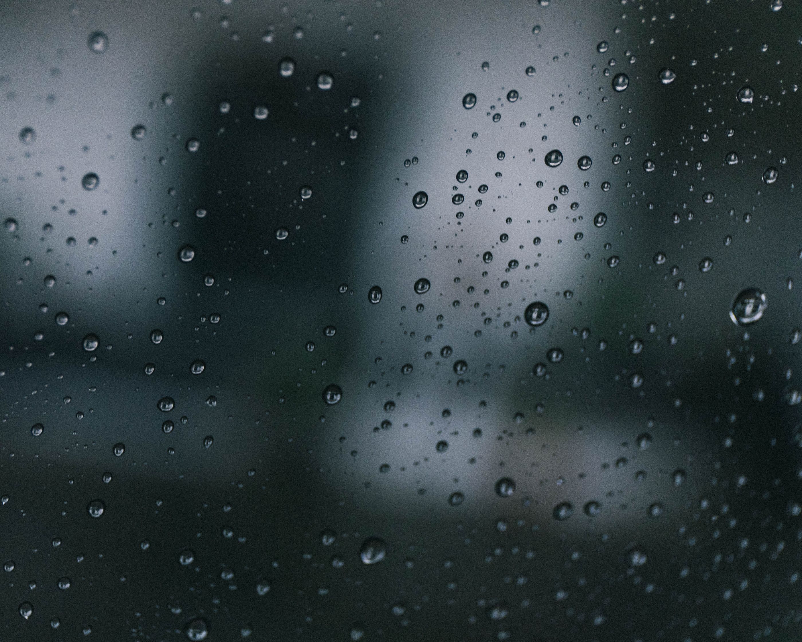
Images
Images can be placed in numerous ways, as seen above, and in the continuation of this page. Take a look at the classes in the style.css along with this html to understand better how to achieve these effects.
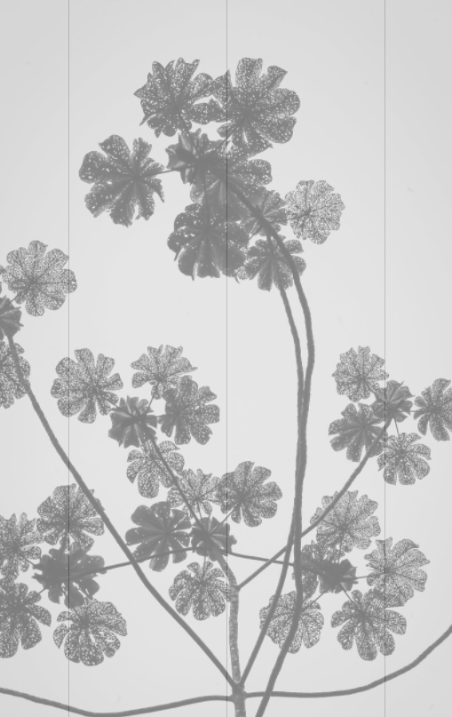
Here we have text that's being wrapped around an image that is floating on the left side.
The image is placed directly into the paragraph where it should show up, and won't flow
out of its bounds. By changing its class' ending letter to "-r", it will float to the right side.
Some images are used to cover the whole row or fill the column they're in.
To cover the whole row, add a column that is absolutely positioned (so that
it won't interfere with the rest of the content), add a class of col10, and full-height (so that it fills the entire row),
and place an image inside it.
Give that image the image-div-cover class, and it will fill the whole column,
and therefore the whole row.
If you wish the row to fill the whole screen, as in the top of this page, give that row
a cont-height100 class as well as max-width-override (as the default max-width for rows is 1200px), and
do the aforementioned steps. Voila! The entire screen is covered.
In the upcoming segment, the images have multiple classes as well as their container divs, all working together in order to align them on multiple screen sizes appropriately, as well as the text contained with them.


The Gallery below can be used as is, perhaps instead of the previous image segment,
or it can be used as an entire page for itself, where you would wish to put your work or products.
It is integrated with the Lightbox, just like the previous segment, but the styling for it
is separated in gallery-images.css for ease of use.
Gallery


That's the basics covered! Thank you for picking up the Bare Bones template and trying it out.
Have fun!